SOUTH AFRICA NATIONAL TEAM
Промпт / Prompt
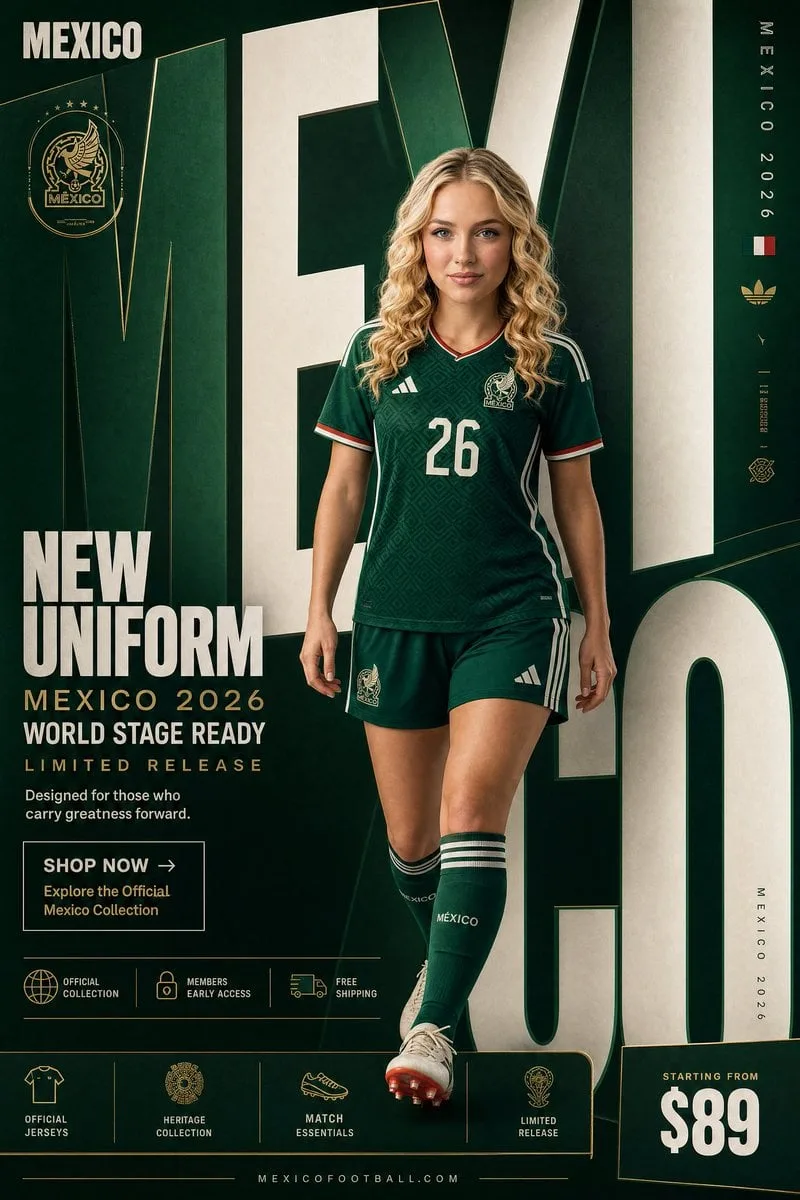
SOUTH AFRICA NATIONAL TEAM "NEW UNIFORM" FORMAT Ultra-Premium Football Fashion SMM Promotional Poster Vertical 4:5 Instagram Hero Creative Global Sportswear Advertising Commercial Football Graphic Design Agency-Level Art Direction Behance Front Page Quality 8K UHD Hyper-Realistic Football × Fashion × Graphic Design Fusion Zero AI Slop Zero Generic Sports Posters Zero Match-Day Graphics Zero Editorial-Only Aesthetic CORE STRATEGY This is not a football poster. This is a national identity statement disguised as a uniform campaign. The design should feel like South Africa's biggest football billboard, a luxury sportswear campaign, and a continental football legacy poster merged into one visual. The graphic design is equally important as the athlete. Typography is not decoration. Typography is architecture. CAMPAIGN IDEA "NEW UNIFORM" Not just a jersey. A symbol of unity. A symbol of resilience. A symbol worn by those who carry a nation's pride forward. The uniform isn't being sold. The identity is. MASTER VISUAL Massive oversized SOUTH AFRICA typography dominates the entire composition. The words: SOUTH AFRICA occupy nearly 75% of the canvas. Typography is integrated into the design. Letters extend beyond frame edges. Some letters cropped. Some hidden behind the player. Some functioning as compositional structures. The typography should feel monumental. The official federation crest appears subtly integrated into the layout. HERO SUBJECT Elite female footballer. Natural beauty. Confident expression. Minimal makeup. Champion mentality. No smiling. No dramatic celebration. Relaxed confidence. Wardrobe: South Africa 2026 home jersey. Golden yellow base. Green detailing. Black accents. Matching shorts. Premium football socks. Modern football styling. Clean elite-athlete aesthetic. POSE Player stepping through the giant typography. One foot slightly forward. Direct eye contact. Hands relaxed. Body partially intersecting typography. The feeling: She carries the spirit of champions effortlessly. COMPOSITION Typography occupies 70%. Player occupies 20%. Promotional elements occupy 10%. Visual hierarchy: SOUTH AFRICA ↓ Player ↓ Promotion ↓ CTA Everything feels intentional. COLOR SYSTEM Primary: South Africa Gold Deep Green White Silver Soft Grey Accent: Black Heritage Details Federation Crest Gold Subtle Flag-Inspired Color Accents No neon colors. No trend-chasing palettes. Timeless sporting elegance. BACKGROUND Clean premium sports backdrop. Large soft gradient. Minimal studio environment. Subtle premium texture. No stadium. No crowd. No scenery. The design itself creates the environment. GRAPHIC DESIGN SYSTEM Floating collection cards. Heritage-inspired labels. Minimal grid system. Thin lines. Micro typography. Premium global football campaign hierarchy. International flagship-store energy. PROMOTIONAL ELEMENTS NEW UNIFORM SOUTH AFRICA 2026 READY FOR THE WORLD STAGE LIMITED RELEASE OFFICIAL COLLECTION MEMBERS EARLY ACCESS FREE SHIPPING Integrated naturally into layout. Not banner spam. TYPOGRAPHY HIERARCHY Top Left SOUTH AFRICA small premium wordmark Center Massive Typography S O U T H A F R I C A occupying most of composition bold heritage typography extremely large scale partially cropped Campaign Title NEW UNIFORM bold elegant typography Supporting Copy Designed for those who carry greatness forward. PROMOTIONAL CTA BLOCK SHOP NOW → Explore the Official South Africa Collection BOTTOM FEATURE STRIP OFFICIAL JERSEYS NATIONAL COLLECTION MATCH ESSENTIALS LIMITED RELEASE Bottom Right Starting From $89 Bottom Center Vertical Edge Text SOUTH AFRICA 2026 LIGHTING Luxury sports studio lighting. Large soft source. Editorial contrast. Natural skin rendering. Premium fabric highlights.
Тип / Type: фото / photo
Автор / Author: Kurator
Теги / Tags: пейзаж, люкс, журнальный, реализм, постер, минимализм, 3D, реклама