A movie poster-style portrait work is generated based on the photo pr…
Промпт / Prompt
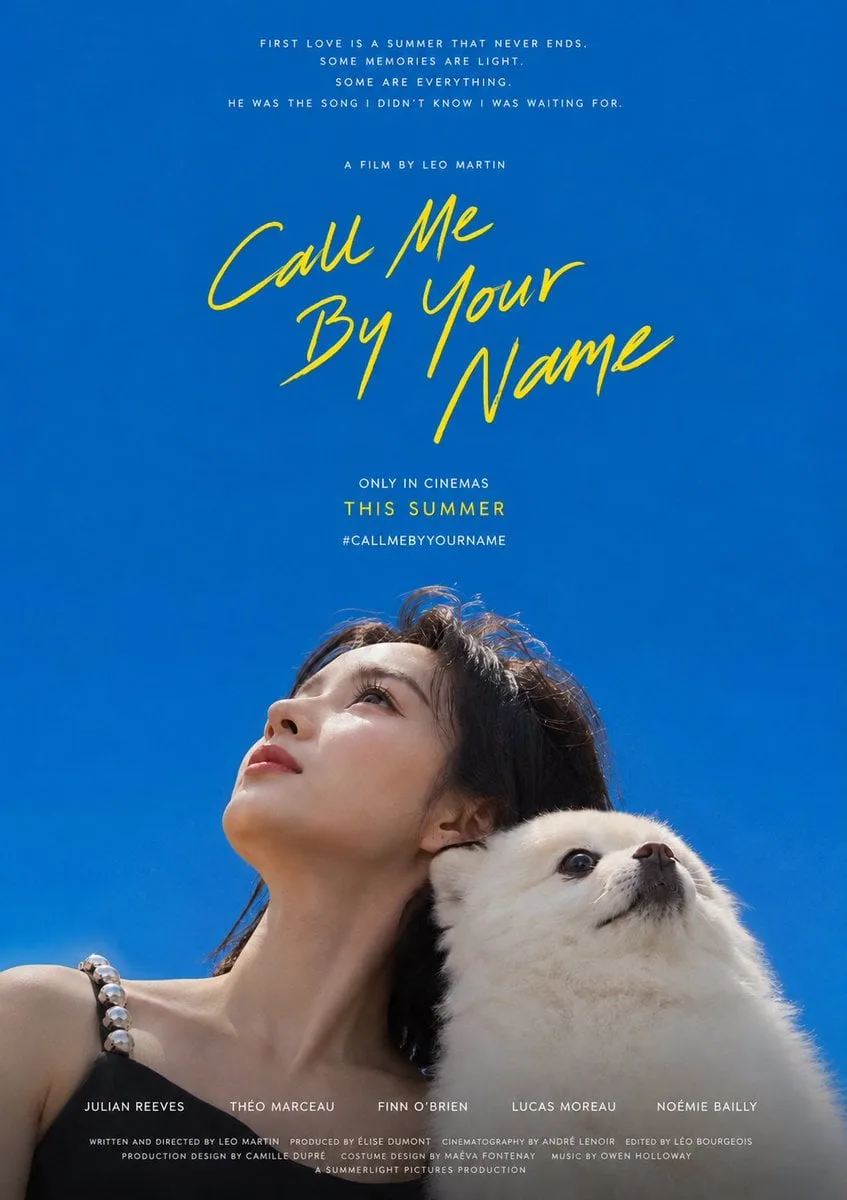
A movie poster-style portrait work is generated based on the photo provided by the user. The core is to use a huge pure color field to hold up the subjects leaning on the edge of the picture and looking up at the sky. About three-quarters of the entire picture is a clean, saturated, monochromatic field without any debris, like an infinitely stretched sky, creating an open, nostalgic, summer-like feeling of blank space. The subject only occupies about a quarter of a narrow band on one side of the picture, leaving most of the space to the empty color field. The composition adapts to the frame: when the portrait is vertical, the subject forms a low horizontal row against the bottom of the picture, and the sky extends upward; when the banner is used, the subject forms a vertical row against one side of the picture (such as the left), and the empty color field spreads widely to the other side (such as the right), and the text falls into that empty field; no matter horizontal or vertical, the subject and the text are always separated at two ends, and the white space dominates. The camera must be shot from a very low angle (insect perspective) from below: each character's head is tilted back, the chin is raised, the throat and neck are stretched, and the face is gazing upward toward the empty color field above the head. What the viewer mainly sees is the bottom edge of the mandible and the profile of the profile or three-quarters of the face - the character never faces the camera, never looks level with the camera, does not make a frontal ID-style portrait, and the line of sight does not fall on the viewer but on the sky above. Only the head, shoulders and a small amount of the upper body are exposed, and the lower edge is naturally cut off by the edge of the picture. There are no restrictions on the types of subject objects, and everything is subject to the objects that actually appear in the input photos; their identity, quantity, type, and combination must be strictly faithful to the original photos and correspond one-to-one, and no extraneous objects outside the picture can be multiplied, copied, multiplied, or added out of thin air. The key snuggling posture is to lean on each other instead of looking at the same place: the subjects are back to back, head to head, or one person leans the back of his or her head on the shoulder and neck of the other person, leaning towards each other in opposite or different directions. Each subject raises his head to the sky on his own side, and his eyes diverge towards the empty color field in different directions, rather than converging on the same focus; each subject keeps their chin raised and looks upward, conveying the overall emotion of snuggling, intimacy and ecstasy. Do not make multiple copies of the same face or object unless the user explicitly requests duplication or mirroring. In the empty space away from the main body, a handwritten title text with white strokes and slight continuous strokes is placed. The font shape is casual, slightly slanted and hand-painted. It is divided into two or three rows and arranged at random. A bright accent color (bright yellow temperament, the hue can be fine-tuned according to the theme's mood) is used to form a warm contrast with the main color field, making this set of words like a private signature floating in the air. The title text content defaults to the handwritten English "Call Me By Your Name" and is replaced with user-specified content only when the user provides custom text. The title position adapts to the frame: when it is vertical, it falls in the middle of the empty field above; when it is banner, it falls in the center of the large blank space opposite to the main body. Place one line of smaller descriptive text in thin font above the title (default "a film by..." style), and two or three smaller lines of information in accent color or white caps below the title (default "IN SELECT THEATERS / NOVEMBER 24 / #CMBYN" This kind of theater release and label-style phrases can be customized by users); the vertical version can also stack several lines of very small white movie review quotation phrases in the center of the top, and press a line of white capital letters and a whole block of fine and low-key copyright information strips at the bottom to form a complete text order of the movie poster. The main color field defaults to the pure, saturated, slightly darker cobalt blue/azure of the original work - the blue of the sky on a sunny summer day at noon, similar to #0A66AC (extremely low red, medium green, high blue). It is clearly bluish, not cyan, not gray, not purple, not pink blue, nor navy blue or ink blue; it is only replaced as a whole when the user specifies other theme colors, and the same relationship of purity, saturation and high brightness must be retained after replacement. The overall color role is: a single large-area pure high-brightness color field dominates, a warm handwritten accent color (default bright yellow) is the finishing touch, white text carries information, and the characters retain their true natural skin color and clothing color. The picture should be bright, transparent, clean, saturated but not dirty, with a gentle atmosphere of openness and longing; even if a deeper color field is used, the light should be clear, the color levels should be clear, and the white space should be breathable to avoid becoming gray, old, stuffy, dirty or worn. The visual weight is firmly focused on the contrast between the huge empty field and the subject looking up from the edge. The subject must not be enlarged to fill the frame, never be shot head-on, and must never lose the large blank space and the upward diverging line of sight.
Тип / Type: фото / photo
Автор / Author: Kurator
Теги / Tags: постер, портрет