Create an ultra-premium e-commerce sales poster for a sel...
Промпт / Prompt
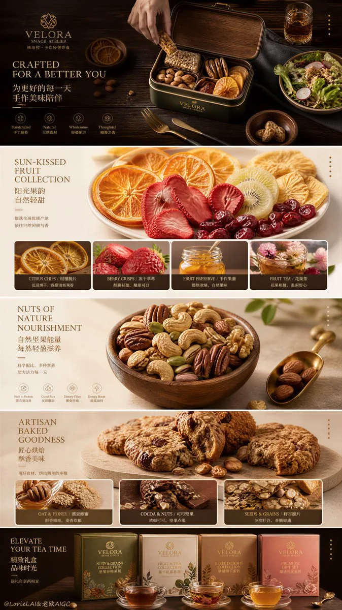
Create an ultra-premium e-commerce sales poster for a self-invented snack and convenience-food brand company, while strictly preserving the exact original vertical stacked-banner layout logic and upgrading the entire page through Milk Cloud Orbit tactile realism plus Cream Halo Transit flagship brand precision into a collector-grade sales key visual. Do not change the structure. Keep the same multiple wide horizontal promotional strips stacked from top to bottom, each strip functioning as a separate same-family campaign panel with left-side headline area, right-side product or plated-food hero, refined promo badge, and minimal side utility elements. The final artwork must feel like a design-award-level collectible sales visual: hyper-real, bold, product-led, materially rich, highly unified, and internationally premium. Brand identity: Create a self-invented premium snack / convenience-food brand such as “VELORA QUICK TABLE”, “AUREL DAILY BITES”, or “EMBER HOME PANTRY”. The brand must feel modern, practical, flavorful, and premium. Use elegant English main titles with smaller Chinese subtitle support, a minimal official logo mark, and a disciplined flagship visual language carried across all strips. Strict original structure: This is essential. Preserve exactly: 1. Long vertical page made of multiple full-width horizontal campaign strips stacked one under another. 2. Each strip keeps: - left-side text zone - right-side hero food or product cluster - one refined promo badge or pricing callout - small side utility or control indicators near the right edge 3. Each strip retains a distinct background surface or color block. 4. Categories vary across strips, but remain unified by one flagship brand system. No grid conversion, no homepage redesign, no card layout. Collector-grade sales visual upgrade: This is critical. Make the whole page feel more like a collectible sales key visual than a regular supermarket-style promotion by: - reducing visual noise - increasing negative space within each strip - simplifying props - making product and plated-food scenes more sculptural - refining badge placement and typography hierarchy - making every strip look like a premium branded print panel The page should still sell clearly, but with far greater visual rarity and art direction. Top strip: Keep the original dark premium strip logic with one ready-to-eat savory hero item such as a personal pizza or baked snack on parchment or a board. Left side carries headline and small copy, right side carries the food. Push crust texture, cheese melt, topping realism, and tabletop richness to a collector-grade level. Keep the promo badge refined and elegantly integrated. Second strip: Preserve the bright light-toned strip featuring a grouped product family. Use low-calorie or better-for-you cups, bottles, or instant snack products arranged in a more premium merchandising composition, with one measuring ribbon or health cue. Keep it cleaner, quieter, and more polished than a normal shelf-promo scene. Third strip: Use the warm wood-tabletop strip with globally inspired meal packs or gourmet ready-meal pouches spread across the right. Add restrained ingredients like tomatoes, dried chili, spice bowls, or herbs. Keep the left-side title area elegant and spacious. This panel should feel warm, ingredient-rich, and premium. Fourth strip: Preserve the pale stone-textured strip with one plated savory food hero such as a crisp pancake, fritter, dumpling-pan dish, or seafood pancake. The dish should feel highly edible and premium, with chopsticks or a tiny sauce bowl used sparingly. The badge and heading must feel refined and not promotional-heavy. Bottom strip: Keep the saturated bold-color closing strip with a large stacked product family cluster on the right. Use meal cups, snack tubs, or bowl-style packaged products built into a strong premium pyramid composition. On the left, keep title, subtitle, and price logic, but quieter and more collectible. This closing strip should feel decisive, bold, and flagship-level. Milk Cloud Orbit realism: Push tactile realism to the highest level across every strip: - pizza crust pores and blistered edges - melted cheese strands and sauce gloss - packaging print sharpness and cup-lid texture - plastic film reflections and paper box grain - curry or sauce density - spice granules and herb surface detail - crisp edges and oil sheen on plated savory dishes - realistic bowl and utensil surfaces Everything must feel touchable, de-AI, and materially expensive. Cream Halo Transit flagship system: Unify the whole stacked page into one stronger flagship brand language. All titles, Chinese subtitle lines, promotion tags, price logic, product names, side utility elements, and micro labels must share one disciplined visual system with calmer spacing, clearer hierarchy, cleaner alignment, and more international editorial-commercial polish. Even though each strip changes color and product type, the whole page must feel like one official brand campaign. Color direction: Preserve the original strip-to-strip contrast: - dark charcoal hero strip - bright cream product-family strip - warm wood ingredient strip - pale stone plated-food strip - bold yellow or saturated closing strip Keep the contrast obvious, but refine the palette so the full page feels mature, collectible, and premium. Lighting: Use high-end commercial lighting tuned per strip: moody on dark surfaces, crisp on pale backgrounds, warm and rich on wood scenes, and sculptural on product stacks. The whole page must feel premium, tactile, and flagship-level. Rendering style: ultra-premium convenience-food e-commerce sales poster, strict stacked horizontal strip layout, Milk Cloud Orbit tactile realism, Cream Halo Transit flagship brand precision, collector-grade sales key visual, multiple snack and ready-meal campaign panels, elegant English main titles with smaller Chinese subtitles, hyper-real packaged food and plated meal photography, award-winning commercial design, 8k, masterpiece quality Negative prompt: changed layout structure, homepage layout, grid cards, cheap supermarket flyer, fake food texture, low-detail packaging, cluttered page, messy typography, generic template, cartoon food, oversaturated colors, harsh flash lighting, noisy props
Модель / Model: Other
Тип / Type: фото / photo
Автор / Author: Loriel.AI
Категории / Categories: Реклама и товары, Мода и стиль, Еда и напитки
Теги / Tags: люкс, журнальный, минимализм, реклама, 3D, постер, логотип, реализм
Похожие промпты / Related
- Create a professional cinematic commercial storyboard in ...
- Ultra-detailed 16:9 oriental fantasy character design she...
- Cinematic 15 second commercial fashion promo shot on 35mm...
- Extreme close-up macro cinematography.
- Create a premium cinematic character bible sheet for a ma...
- A realistic handheld travel vlog filmed by a friend follo...
- Create a premium, ultra-photorealistic 15-second commerci...
- Spider-Man:
- Create a 30-second ultra-realistic candid home-video sequ...
- L’ORÉAL — “NOT A STRAND”
- Setting: A cozy indoor room with warm, ambient lighting, ...
- Premium fashion editorial.